6. Data Visualization
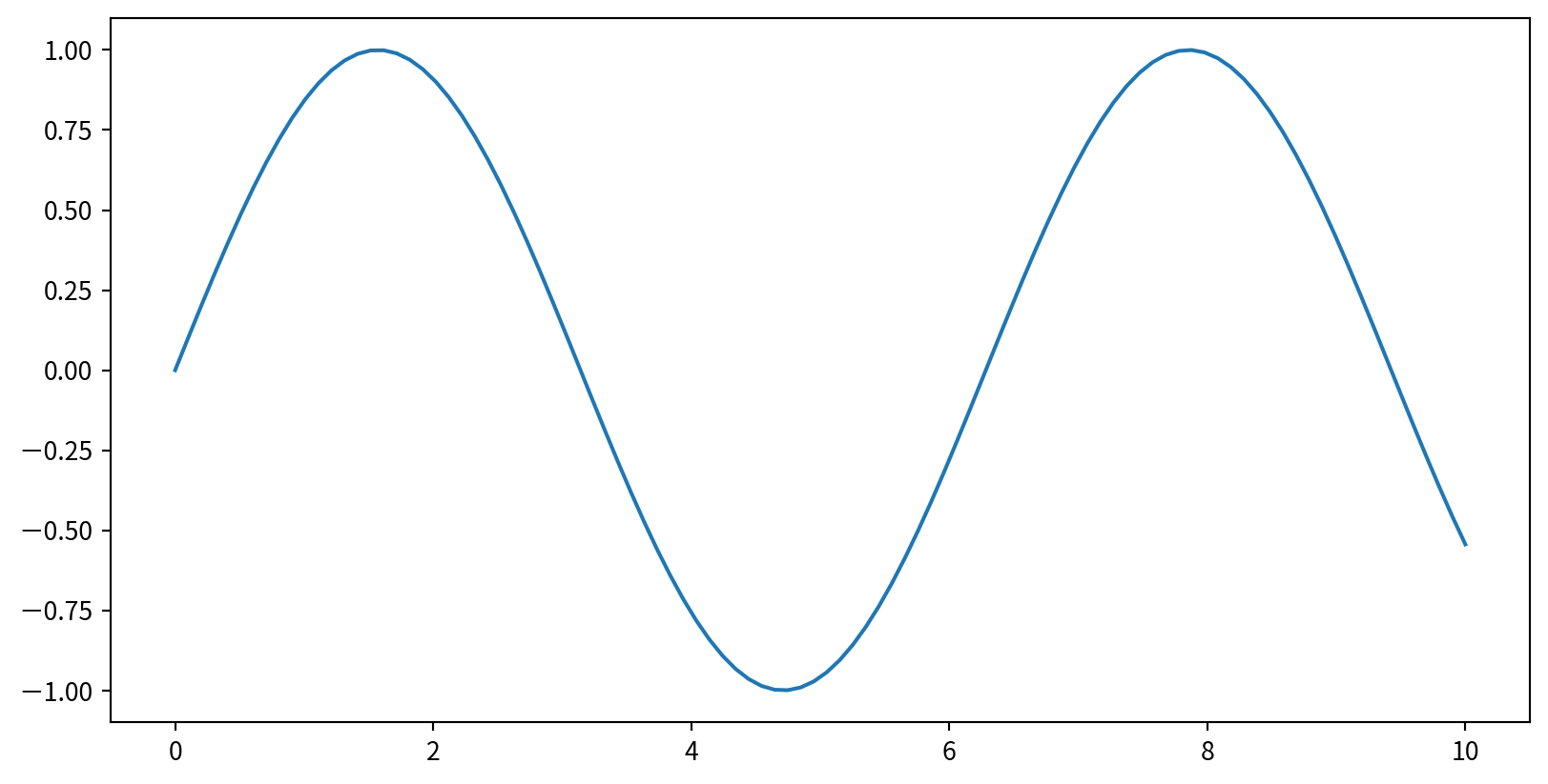
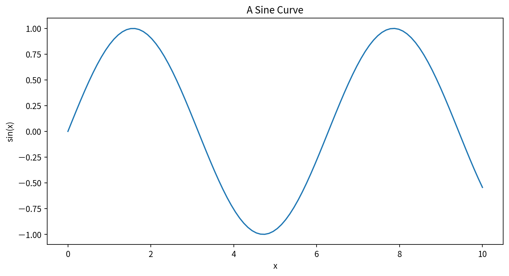
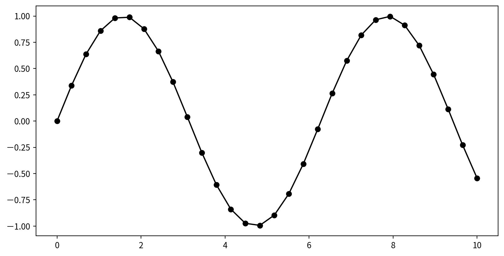
Plotting a Simple Function
使用 plt.plot(x,y), plt來自import matplotlib.pyplot as plt
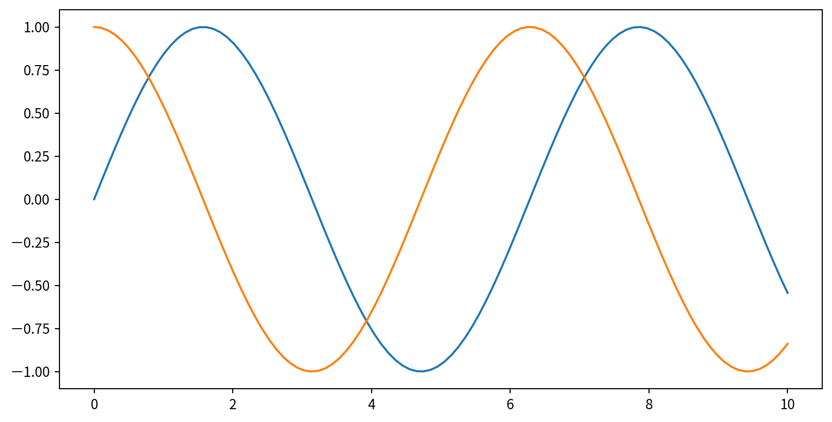
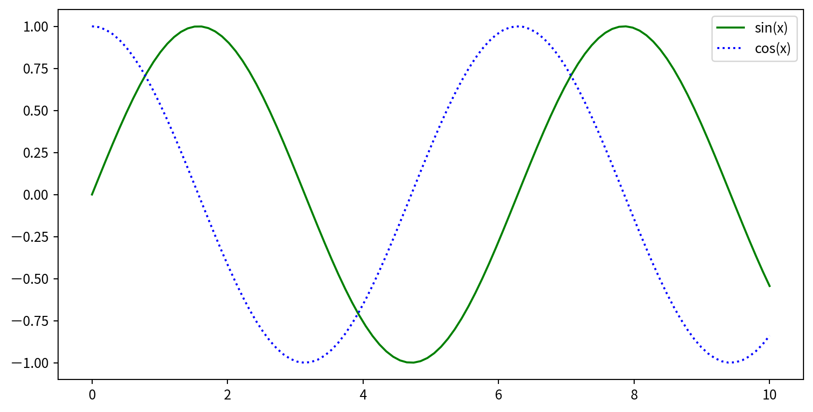
Multiple Lines in One Plot
多次呼叫 plt.plot可直接疊圖
Customizing Line Color
在plt.plot() 中使用 color 參數指定顏色
plt.plot(x, np.sin(x - 0), color='blue')        # by name
plt.plot(x, np.sin(x - 1), color='g')           # short code (r, g, b, c, m, y, k)
plt.plot(x, np.sin(x - 2), color='0.75')        # grayscale
plt.plot(x, np.sin(x - 3), color='#FFDD44')     # hex code
plt.plot(x, np.sin(x - 4), color=(1.0,0.2,0.3)) # RGB tuple
plt.plot(x, np.sin(x - 5), color='chartreuse')  # HTML color name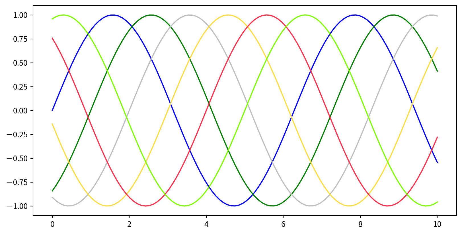
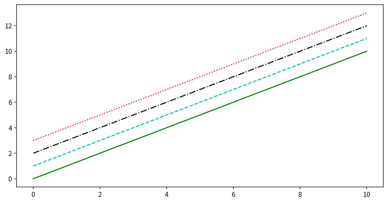
Customizing Line Style
在plt.plot()中使用linestyle 參數指定線段樣式
plt.plot(x, x + 0, linestyle='solid')
plt.plot(x, x + 1, linestyle='dashed')
plt.plot(x, x + 2, linestyle='dashdot')
plt.plot(x, x + 3, linestyle='dotted')
# Short codes:
plt.plot(x, x + 4, linestyle='-')   # solid
plt.plot(x, x + 5, linestyle='--')  # dashed
plt.plot(x, x + 6, linestyle='-.')  # dashdot
plt.plot(x, x + 7, linestyle=':')   # dotted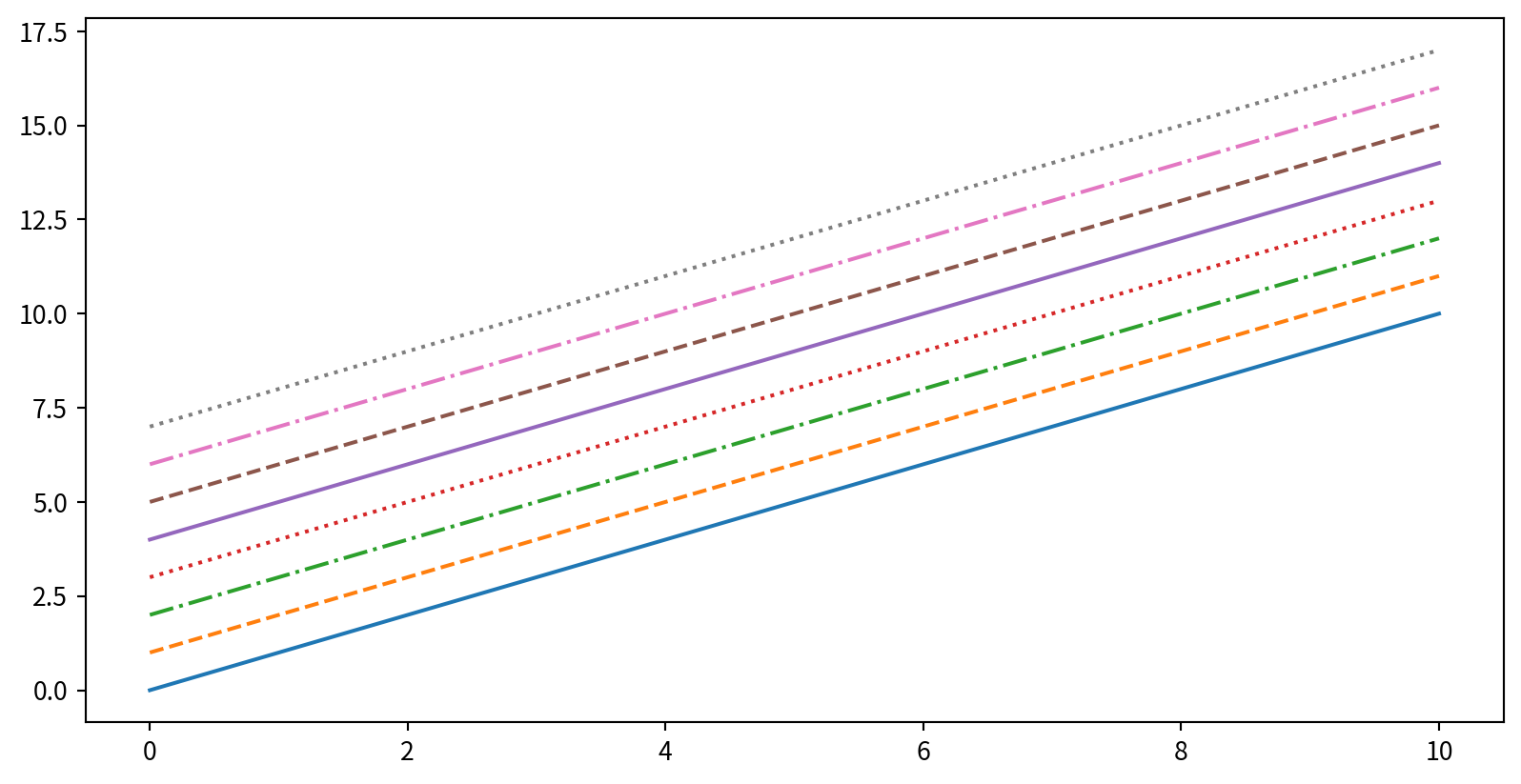
Customizing Line Color and Style
Adjusting Axes Limits
plt.axis([xmin, xmax, ymin, ymax])設定圖片範圍限制,limits要用list包起來[xmin, xmax, ymin, ymax]
Adding Titles, Labels, and Legends
plt.title(), plt.xlabel(), plt.ylabel()
Adding Titles, Labels, and Legends
要呈現圖標,先在 plt.plot() 時增加 label 參數,最後呼叫 plt.legend()
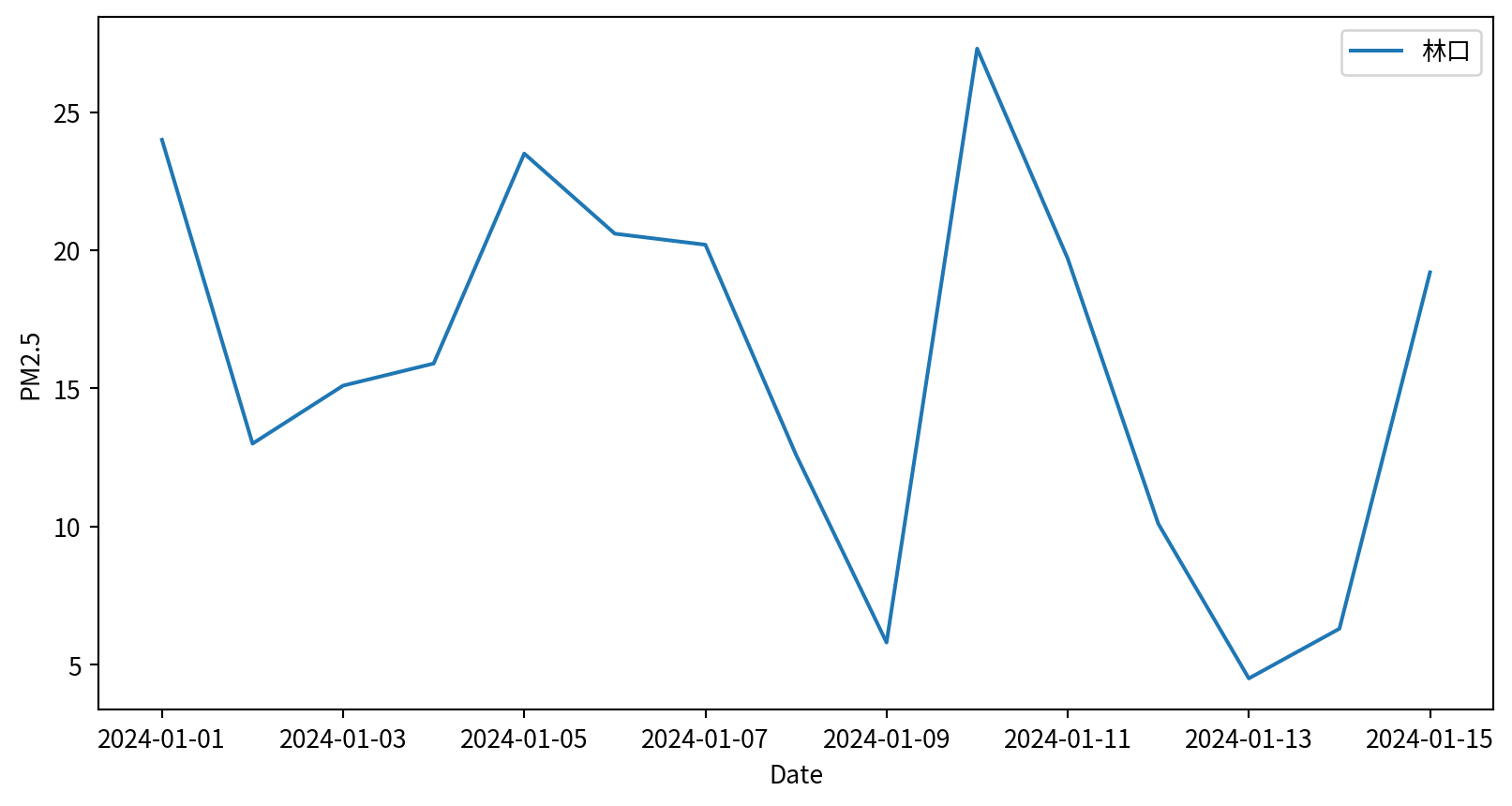
Hands-on - Line Plot
請試著呈現林口測站在2024/1/1~2024/1/15的PM2.5濃度,要呈現figure legend,也要呈現x y 軸的名字
Ref:
Line Plot - Seaborn
sns.lineplot(x,y), x y 為資料點
Line Plot - Seaborn
sns.lineplot(data, x, y), x y 表示 column names

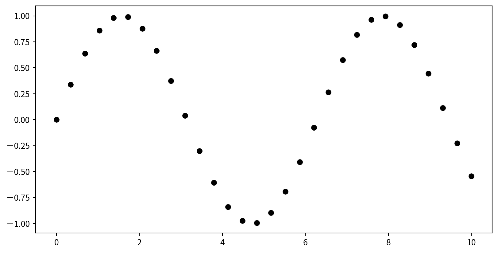
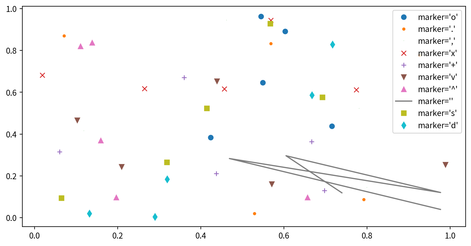
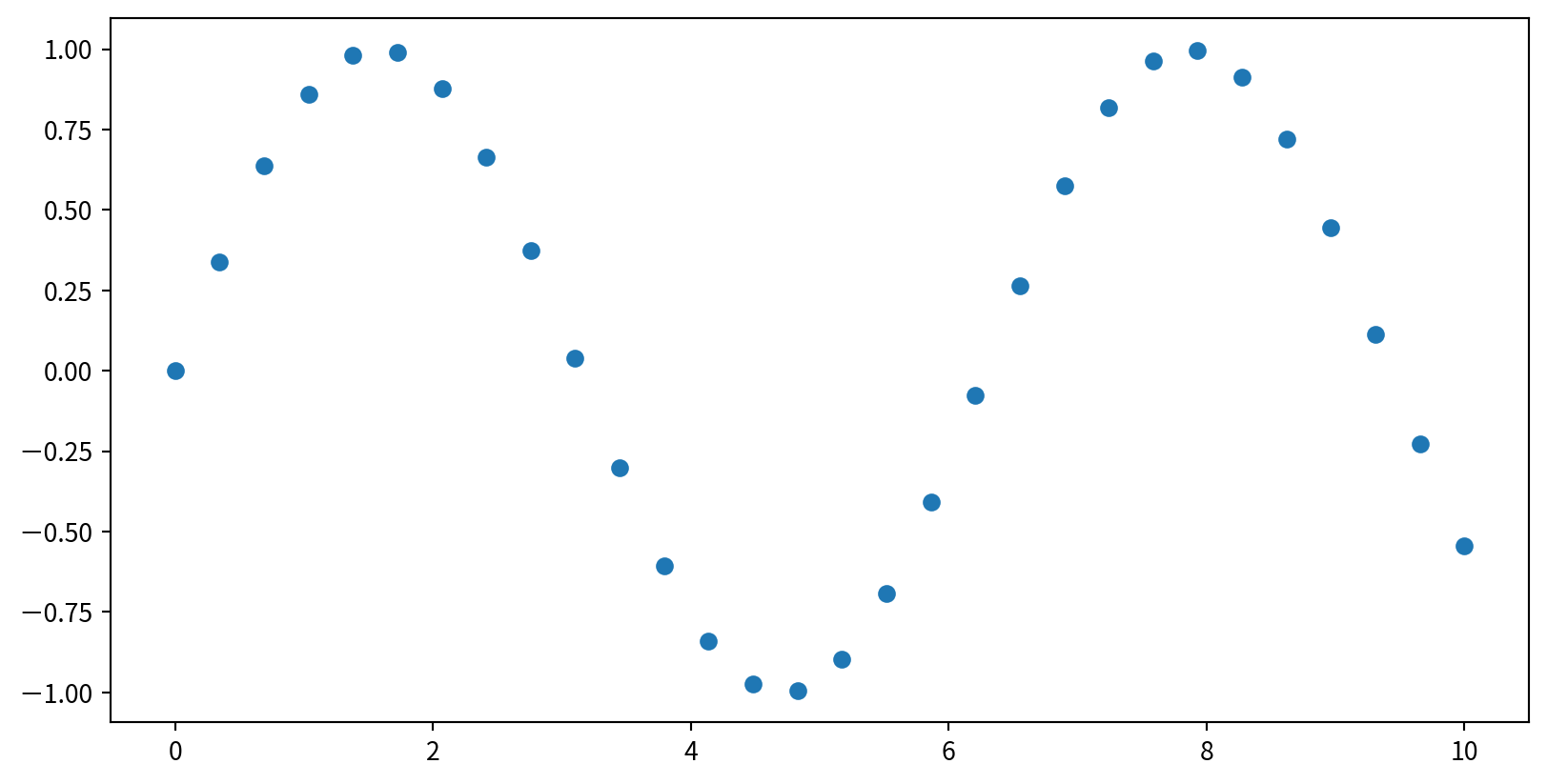
Scatter Plots with plt.plot()
plt.plot(x,y,marker,color), marker 設定點的樣式, color 設定顏色
Scatter Plots - marker shape
'o', '.', ',', 'x', '+', 'v', '^', '', 's', 'd' …
Line styles and marker shape
結合標記與線條樣式,以製作更複雜的圖表
Line styles and marker shape
使用額外的參數來自訂標記和線條

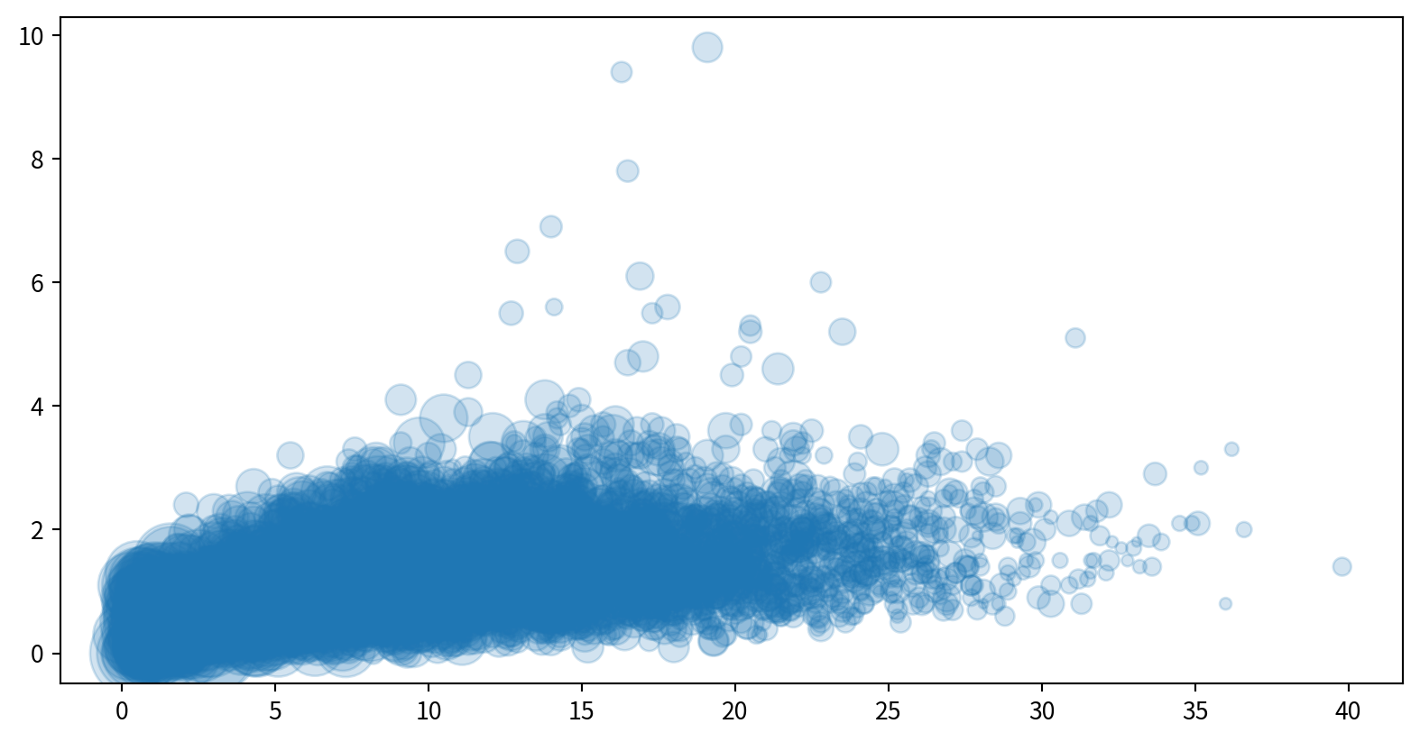
Scatter Plots with plt.scatter
plt.scatter(x, y) 可針對對每個點的size, color及其他屬性進行個別控制。
with varying color and size - Bubble chart
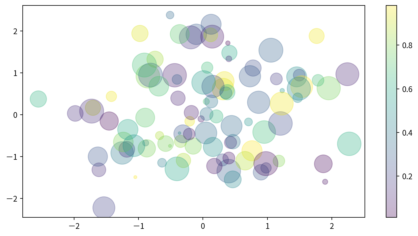
Visualizing Multidimensional Data
x/y 位置、大小與顏色都分別代表不同的資料維度。

Visualizing Multidimensional Data
Text(0, 0.5, 'sepal width (cm)')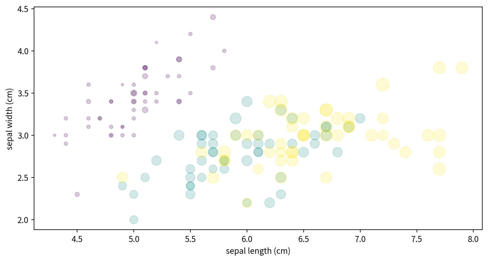
Hands-on - Scatter Plot
試著看看空氣污染資料中,NO2濃度與SO2濃度有沒有相關? Ref:
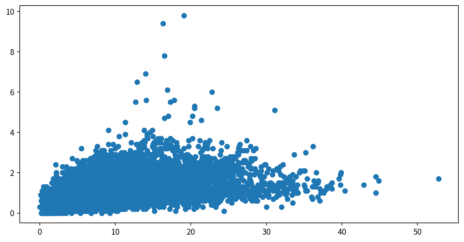
Hands-on - Scatter Plot
使用泡泡圖呈現NO2與SO2的關係,並用風速(WIND_SPEED)當作泡泡大小,觀察這些資料是否有相關
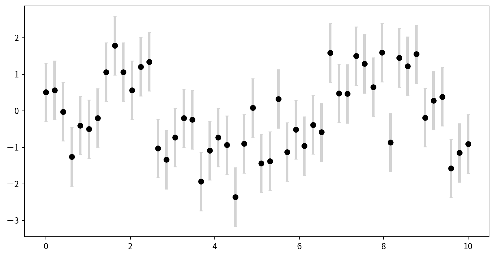
Basic Error Bars with plt.errorbar
Plot: plt.errorbar(x, y, yerr=error size, fmt = style)
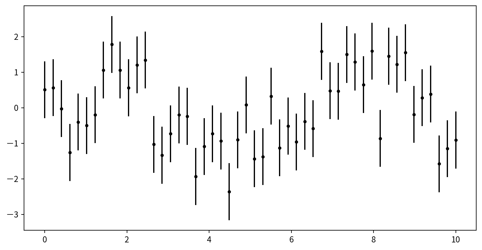
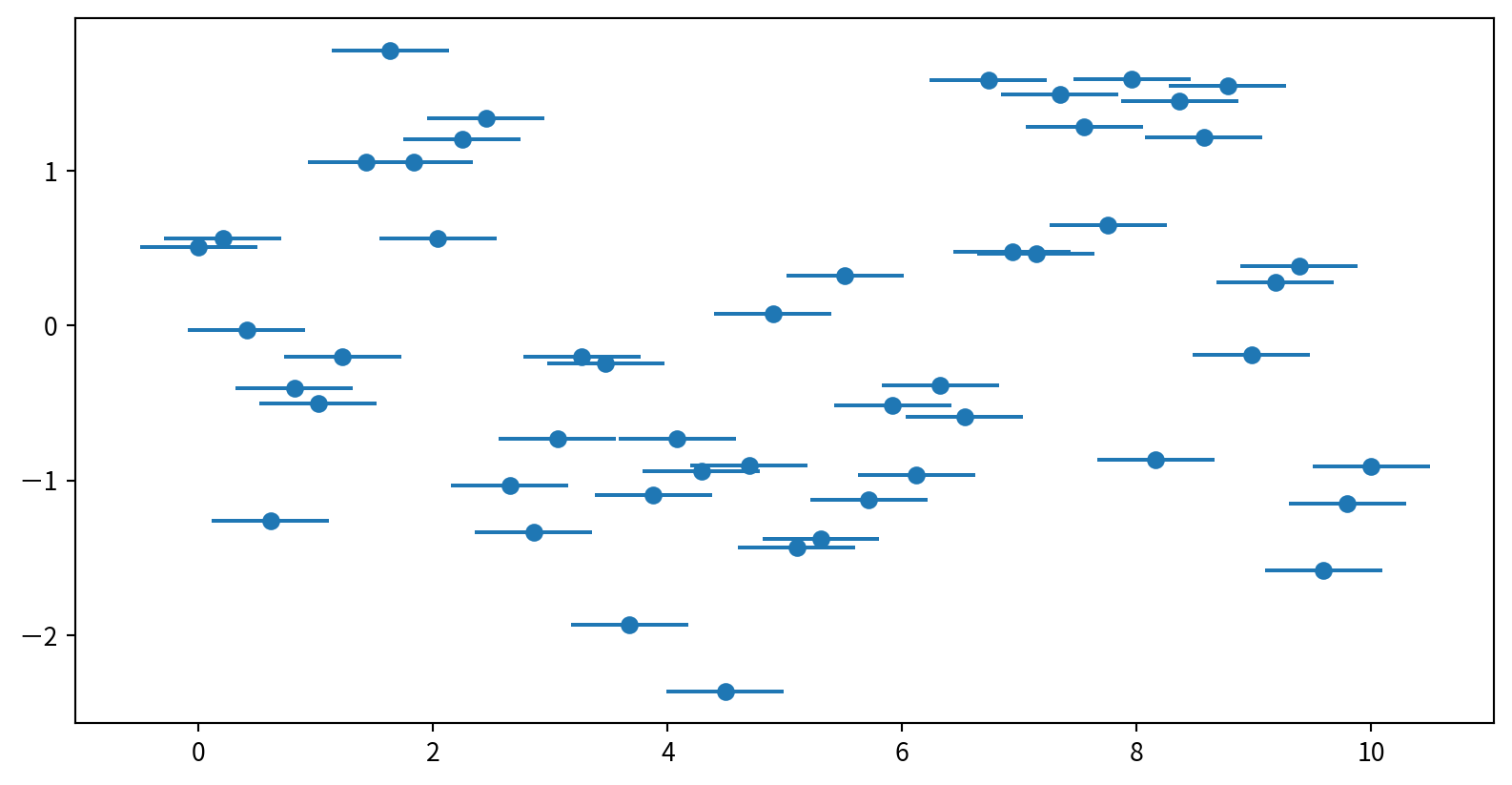
Customizing Error Bars
Horizontal and One-Sided Error Bars
使用 plt.errorbar()中的xerr 增加水平error bar
Creating a Simple Histogram
plt.hist(data), data通常是List 或Series
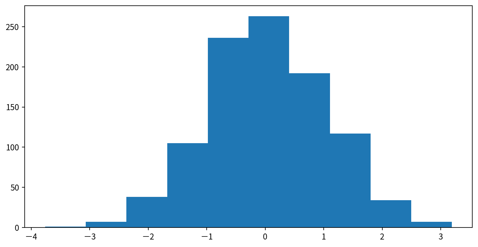
Customizing Histograms
可調整的參數
bins: Number of binsalpha: Transparencycolor,edgecolor: Color settings
Customizing Histograms

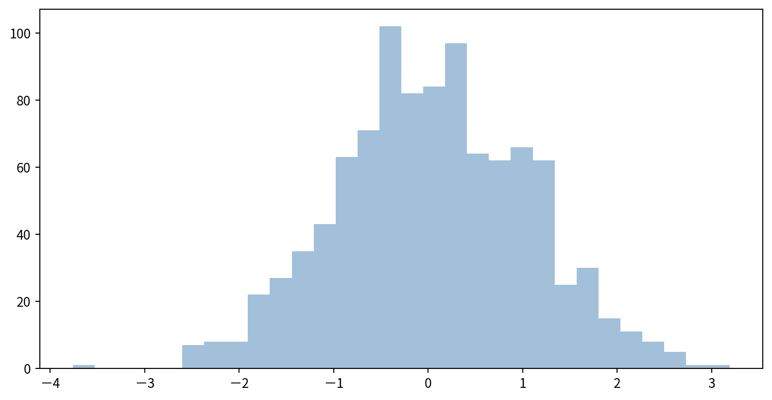
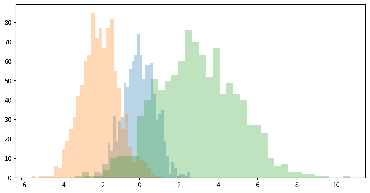
Comparing Multiple Distributions
使用dict(parameters)搭配**kwargs,將參數儲存後,方便多次使用
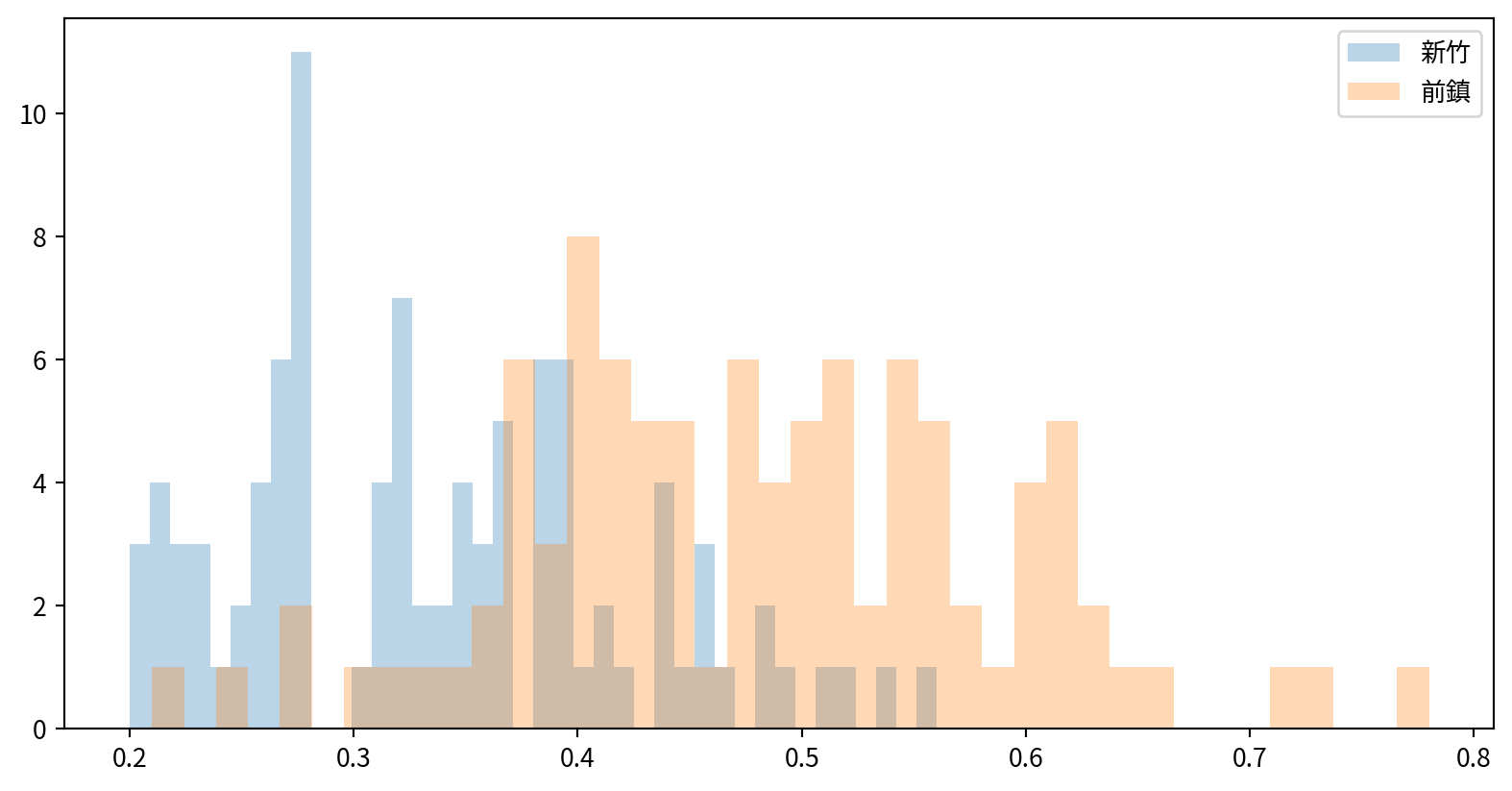
Hands-on - Histogram
看看新竹與前鎮一氧化碳(CO)的資料分布是否有差異(疊在一張圖中)
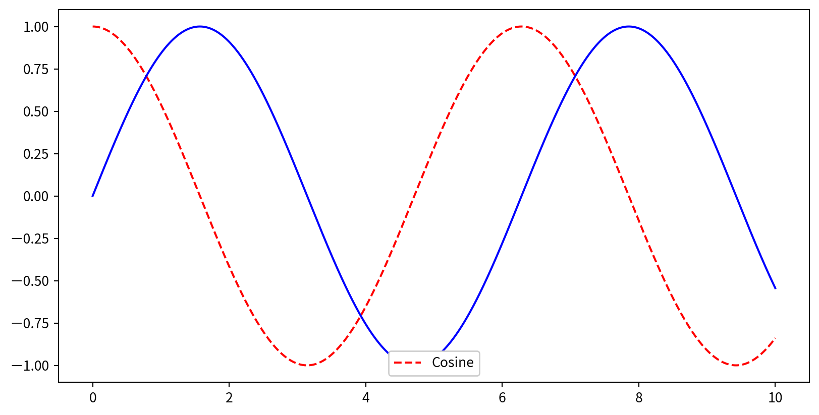
Creating a Simple Legend
x = np.linspace(0, 10, 1000)
fig = plt.figure()
plt.plot(x, np.sin(x), '-b', label='Sine')
plt.plot(x, np.cos(x), '--r', label='Cosine')
plt.axis('equal')
plt.legend()
- By default, all labeled elements are included in the legend
Legend Placement and Appearance
Legend Placement and Appearance

Choosing Elements for the Legend
如果有線段不需要圖標,可以直接不設定label
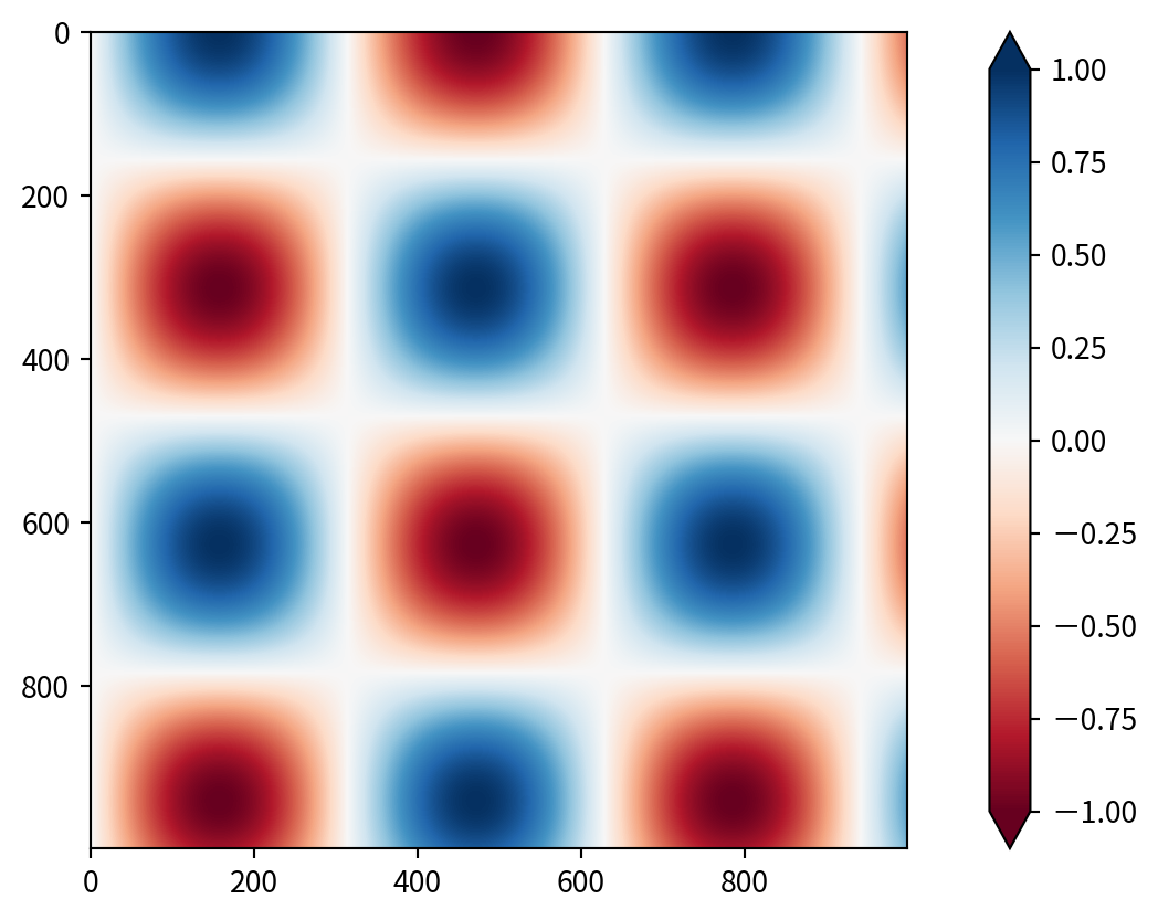
Creating a Basic Colorbar
使用 plt.colorbar() 增加顏色對照表
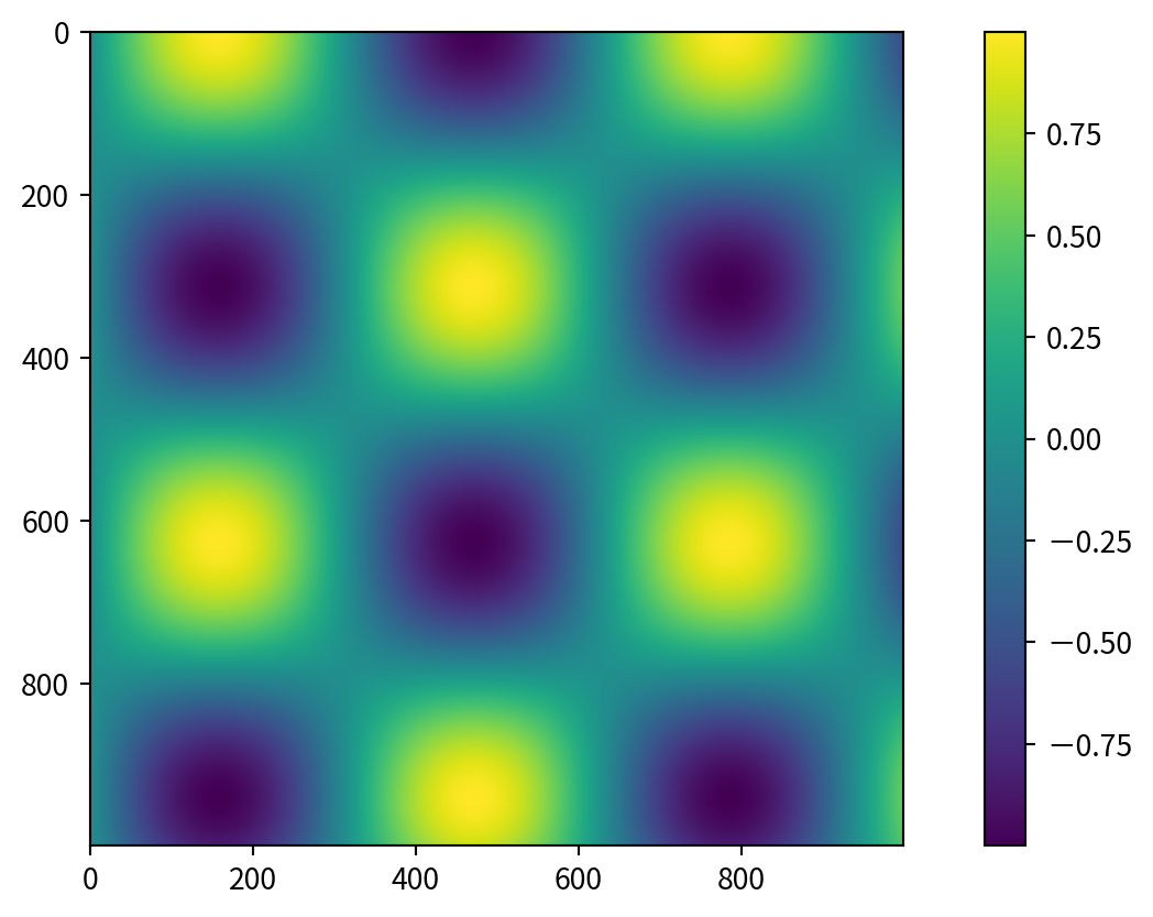
Customizing Colormaps
使用預設的color map,並用cmap參數設定 (check plt.cm namespace (e.g., plt.cm.viridis, plt.cm.RdBu))

Setting Color Limits and Extensions
- 使用
plt.clim()手動設定顏色範圍(以聚焦於特定的資料區間) - 在
plt.colorbar()中使用 extend 參數來標示超出範圍的數值

Setting Color Limits and Extensions
Discrete Colorbars
可以用 plt.cm.get_cmap() 取得不連續的色塊,參數為哪個幾個色塊with number of bins

1. Manual Placement with plt.axes
透過在圖形座標(0 到 1 之間)中指定 [left, bottom, width, height],可以在圖中任意位置建立座標軸(axes)。
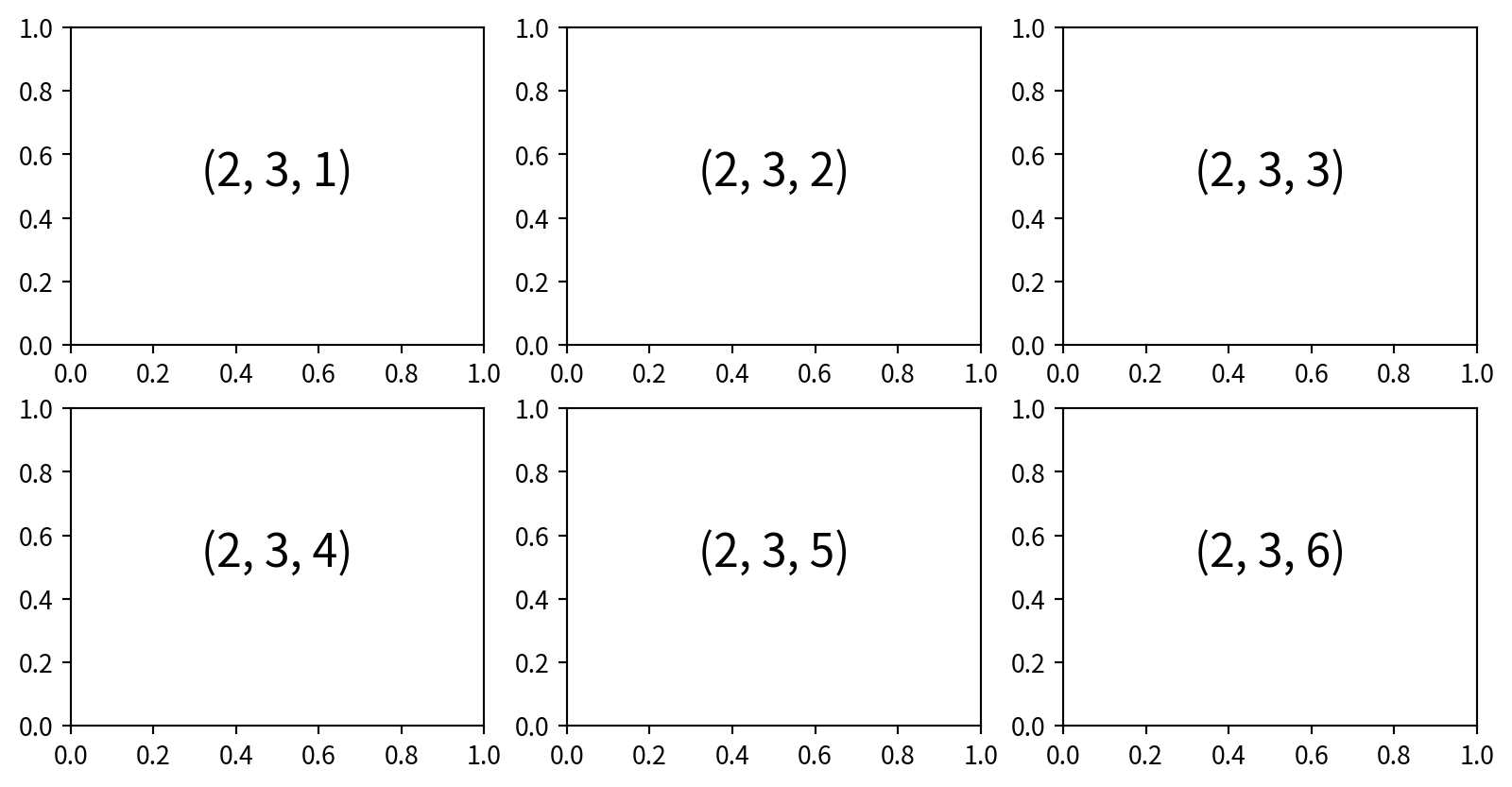
2. Simple Grids with plt.subplot
透過指定row、col和圖表索引plot index(從 1 開始,順序為從左到右、從上到下),可以建立子圖的網格 plt.subplot(row, col, plot index)
3. Flexible Layouts with
可使用plt.GridSpec(row,col)設定更複雜的子圖排版
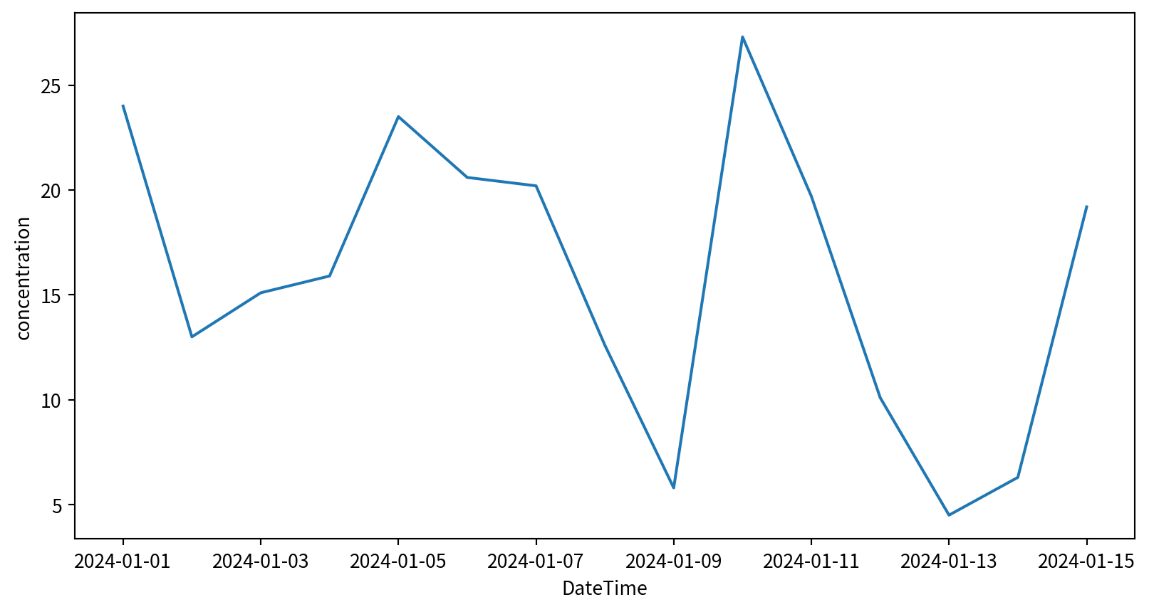
管制圖 Control chart
若以三倍標準差當作管制界線,僅有幾個點超過兩個標準差,應在誤差範圍內
fig = plt.figure()
pm25Linkou =  pm25Linkou.sort_values("DateTime")
plt.plot(pm25Linkou['DateTime'], pm25Linkou['concentration'])
plt.axhline(y=pm25Linkou['concentration'].mean(skipna=True),
            color='g', linestyle='-')
plt.axhline(y=pm25Linkou['concentration'].mean(skipna=True)+
            2*pm25Linkou['concentration'].std(),
            color='y', linestyle=':')
plt.axhline(y=pm25Linkou['concentration'].mean(skipna=True)-
            2*pm25Linkou['concentration'].std(),
            color='y', linestyle=':')
plt.axhline(y=pm25Linkou['concentration'].mean(skipna=True)+
            3*pm25Linkou['concentration'].std(),
            color='r', linestyle=':')
plt.axhline(y=pm25Linkou['concentration'].mean(skipna=True)-
            3*pm25Linkou['concentration'].std(),
            color='r', linestyle=':')
plt.show()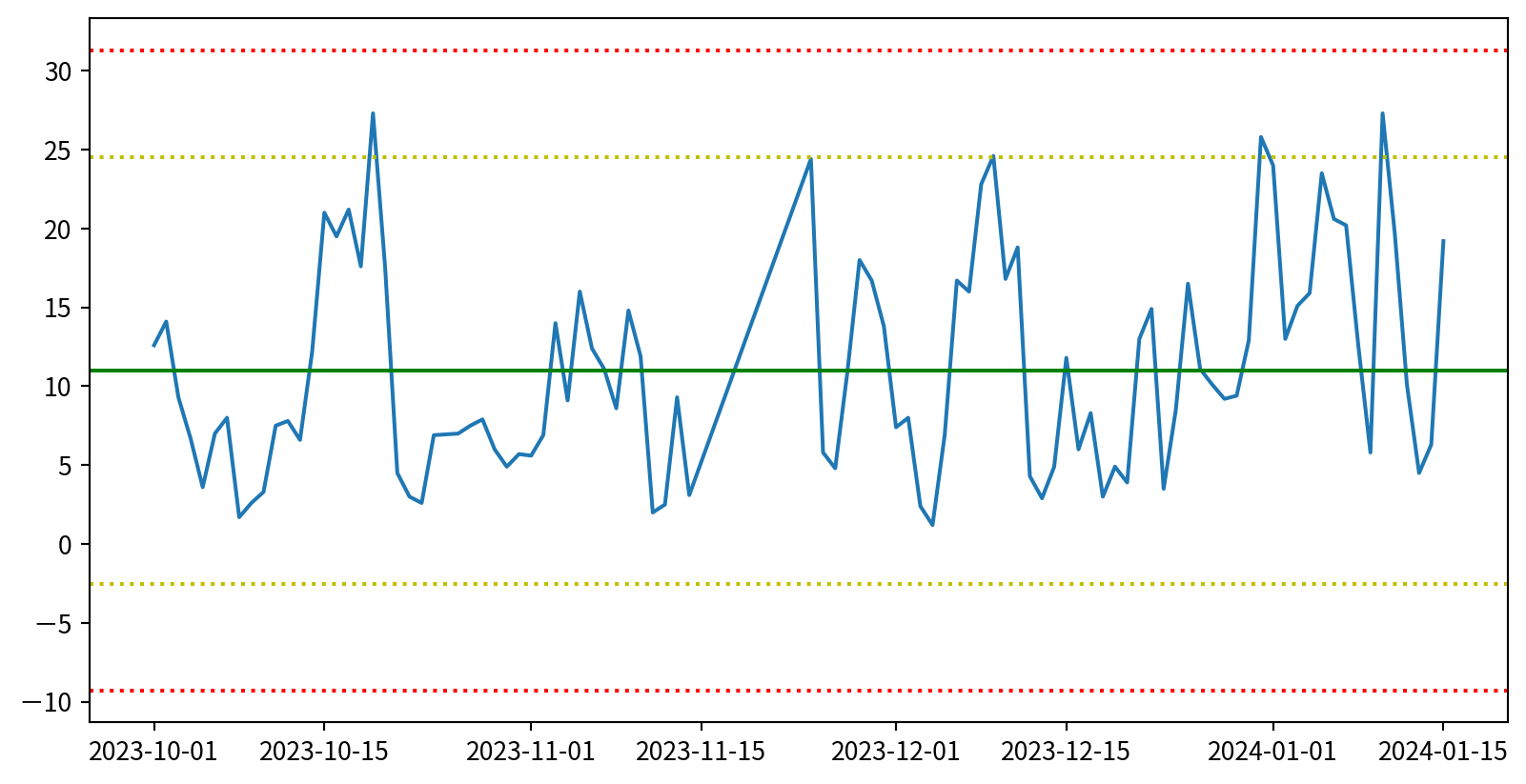
管制圖 Control chart
若以三倍標準差當作管制界線,僅有幾個點超過兩個標準差,應在誤差範圍內

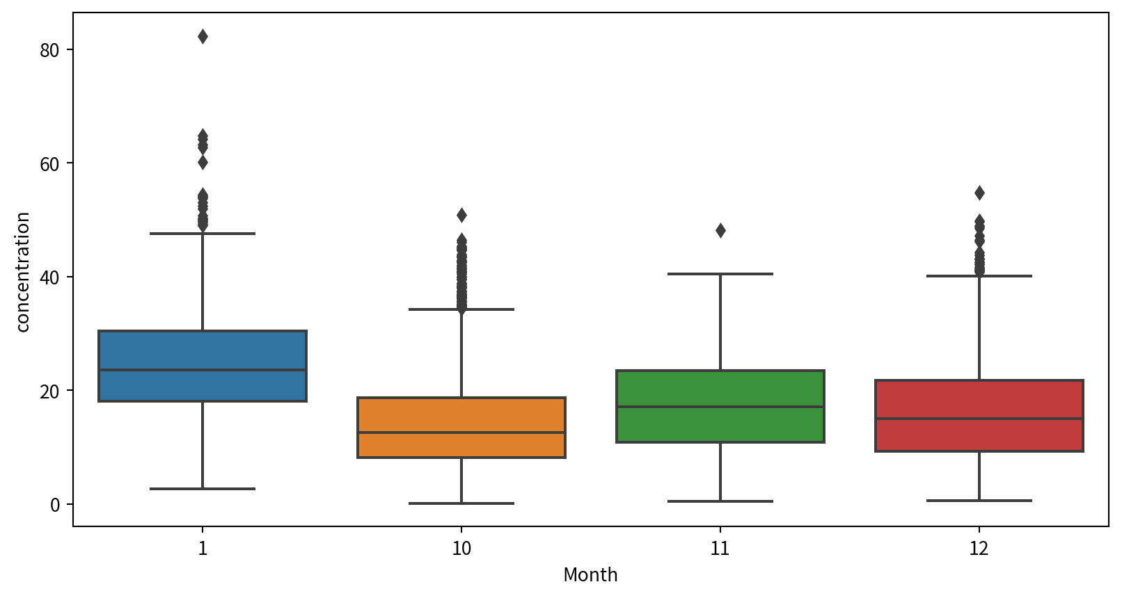
盒鬚圖 Box plot
使用seaborn套件的boxplot()函數,可製作盒鬚圖,輸入參數為:
- data:資料框
- x軸:測站
- y軸:各月份要比較的數據分佈(此為PM2.5)
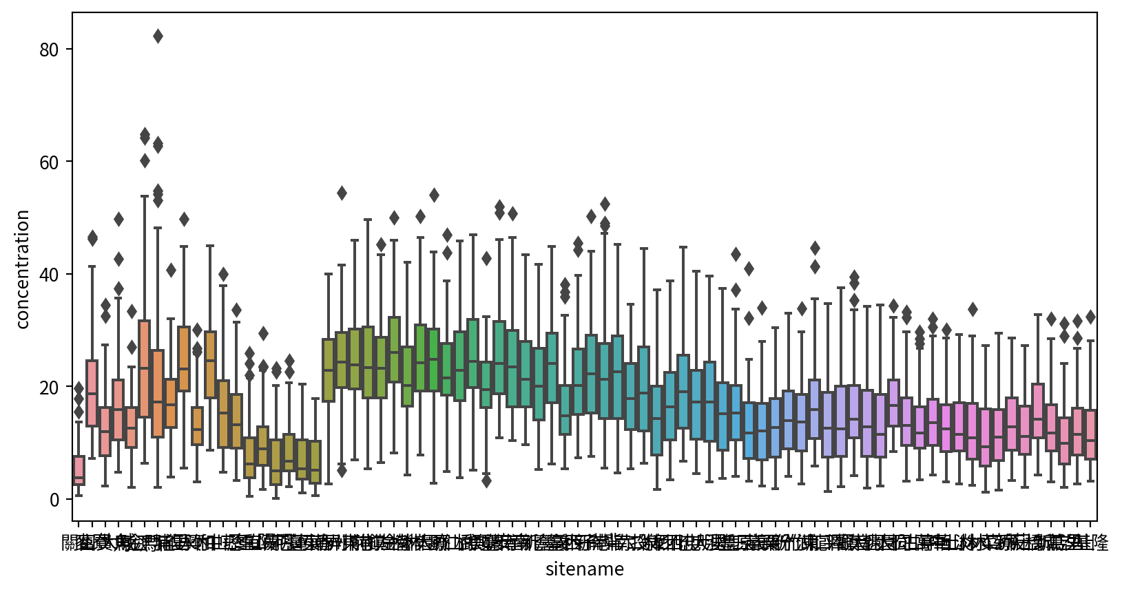
盒鬚圖 Box plot

盒鬚圖 Box plot
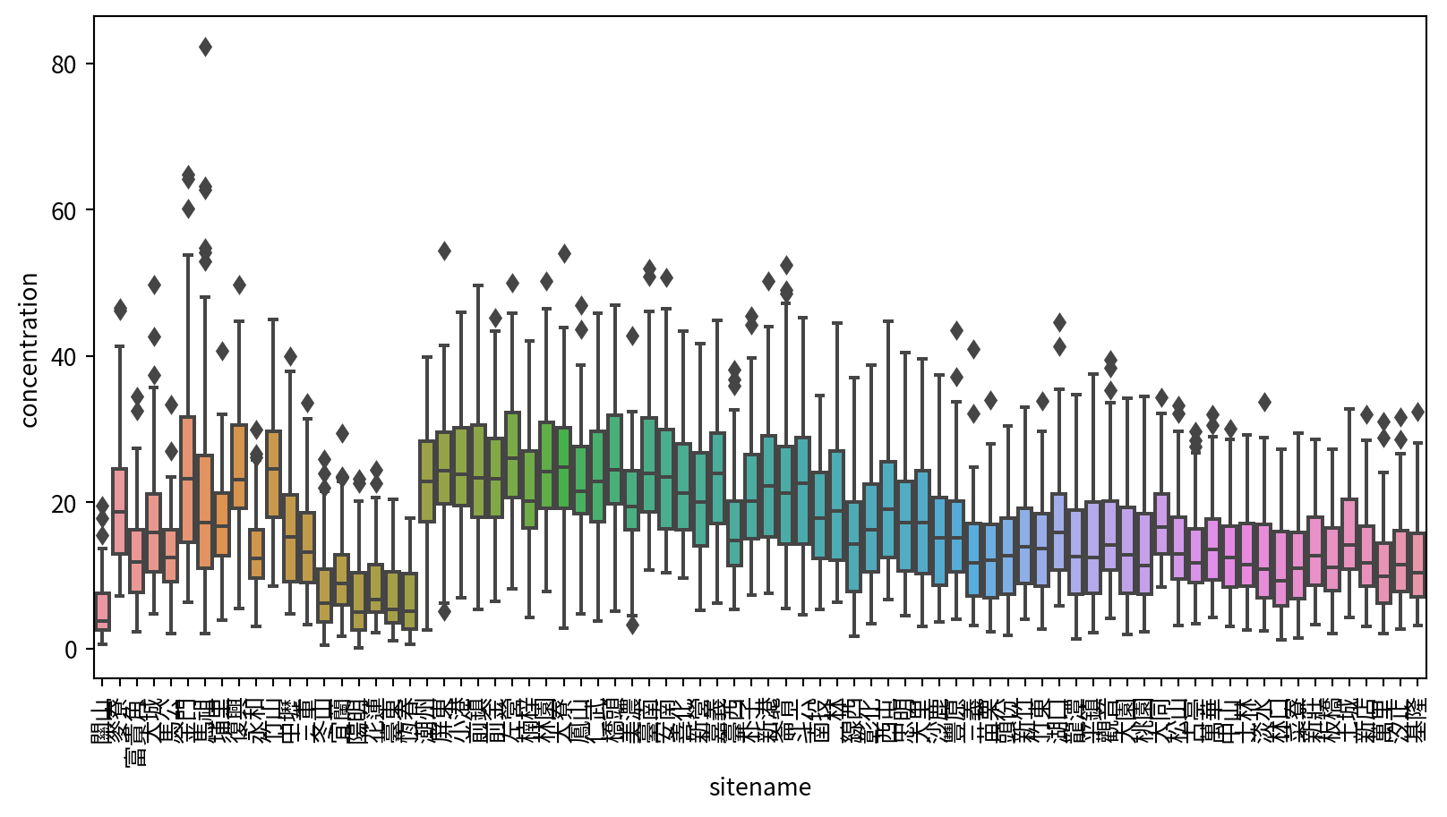
Hands-on 盒鬚圖
Ref:
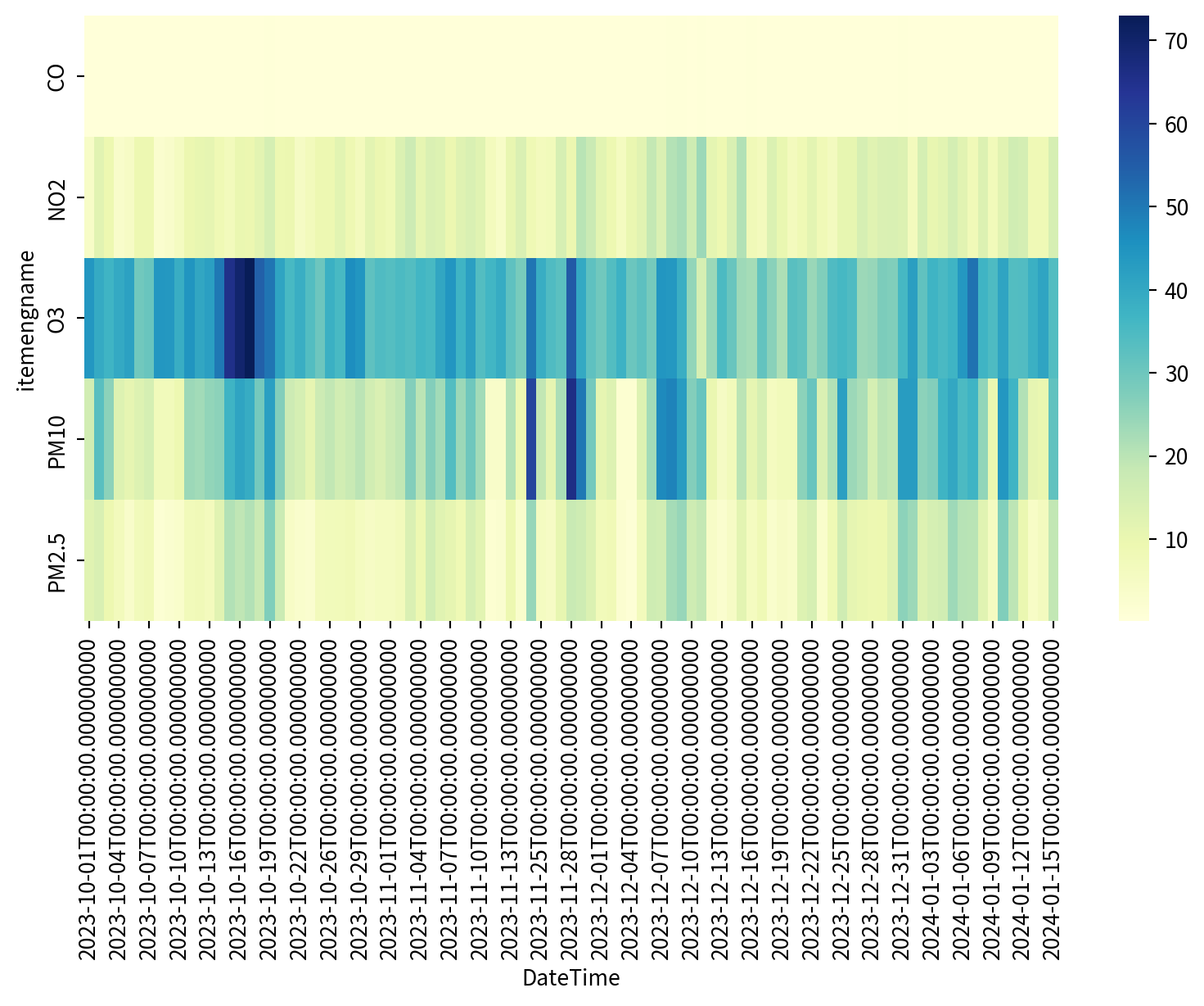
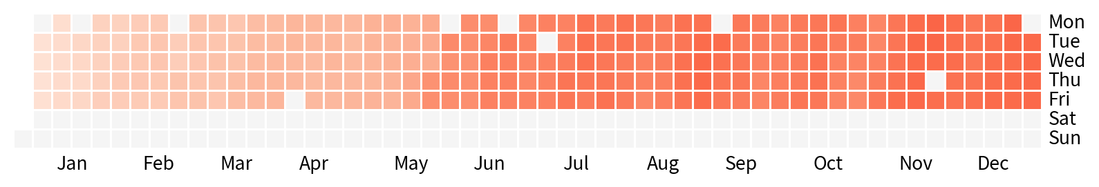
熱度圖 Heatmap
月曆熱度圖
calmap.yearplot(資料框)即可畫月曆熱度圖
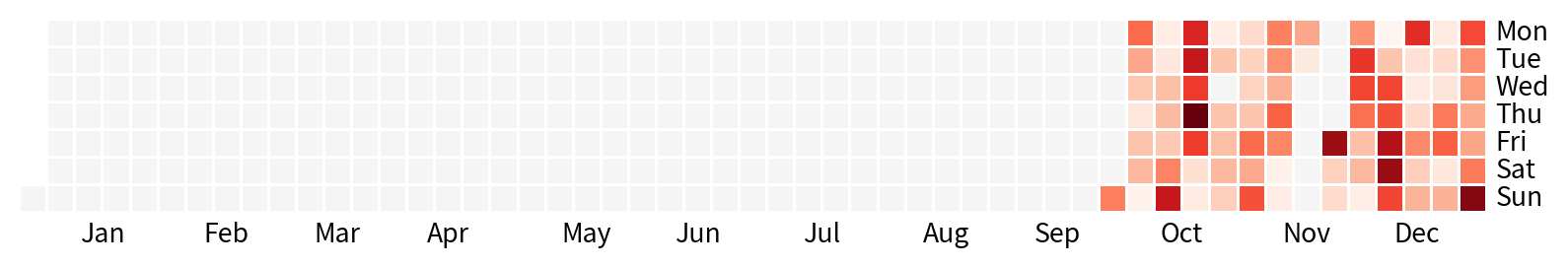
Hands-on 月曆熱度圖
下一步則是安裝套件
參考:
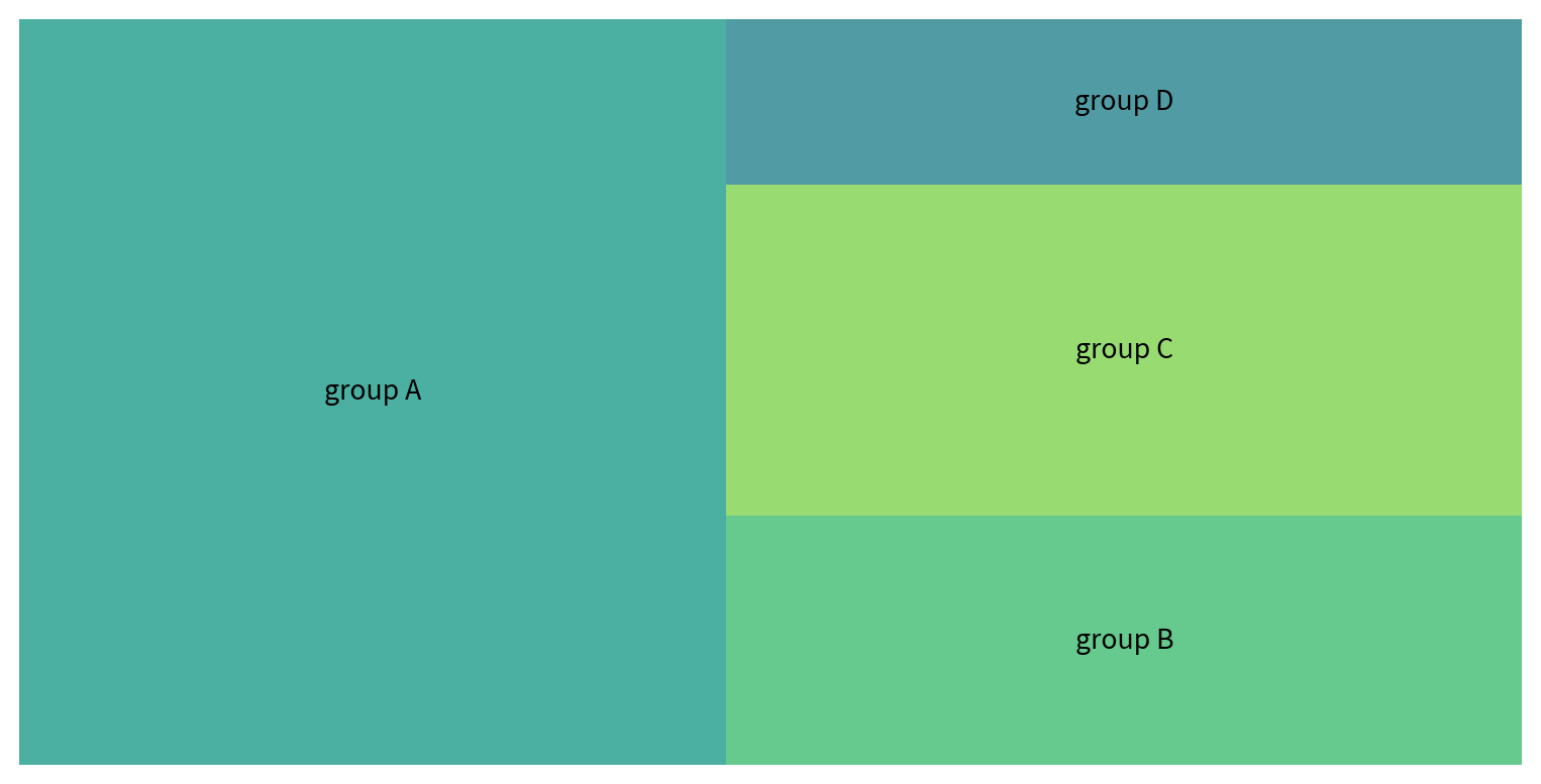
矩形圖 Tree map
使用squarify套件的功能,設定sizes, labels即可
!pip3 install squarify
import squarify
squarify.plot(sizes=df_sq['nb_people'],
              label=df_sq['group'], alpha=.8 )
plt.axis('off')
plt.show()
Requirement already satisfied: squarify in /Library/Frameworks/Python.framework/Versions/3.11/lib/python3.11/site-packages (0.4.4)
[notice] A new release of pip is available: 24.0 -> 25.1.1
[notice] To update, run: pip install --upgrade pip